Chocomo International Branding
Icon
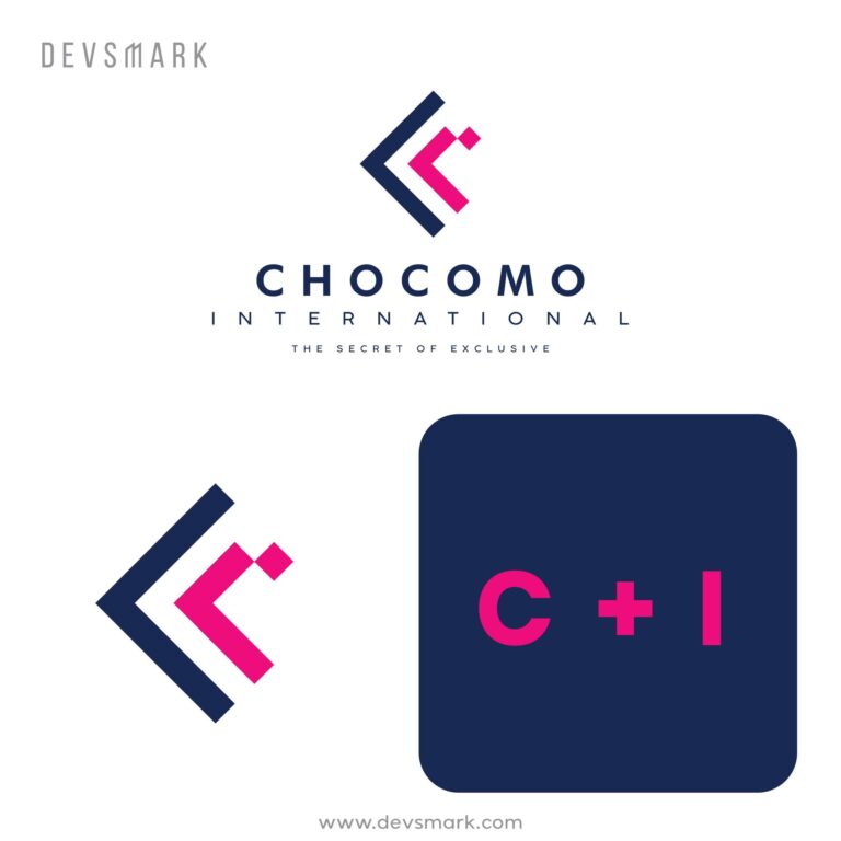
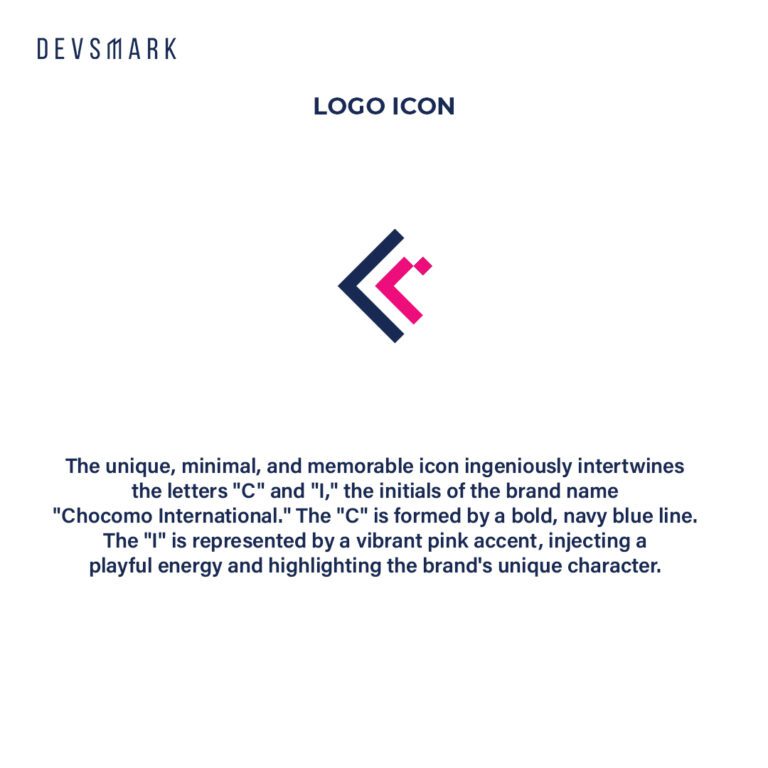
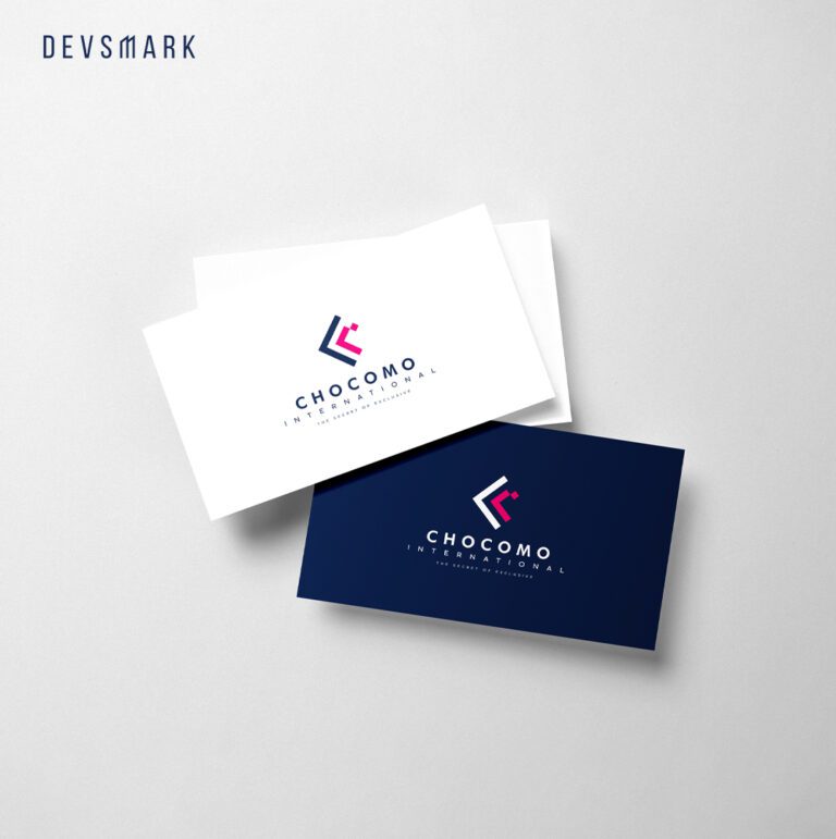
The unique, minimal, and memorable icon ingeniously intertwines the letters “C” and “I,” the initials of the brand name “Chocomo International.” The “C” is formed by a bold, navy blue line. The “I” is represented by a vibrant pink accent, injecting a playful energy and highlighting the brand’s unique character.
Typography
The brand name “CHOCOMO” is set in a bold, sans-serif typeface, exuding confidence and sophistication. The all-caps lettering adds a touch of formality, while the rounded edges of the letters soften the overall look, creating an inviting feel.
Colour palette
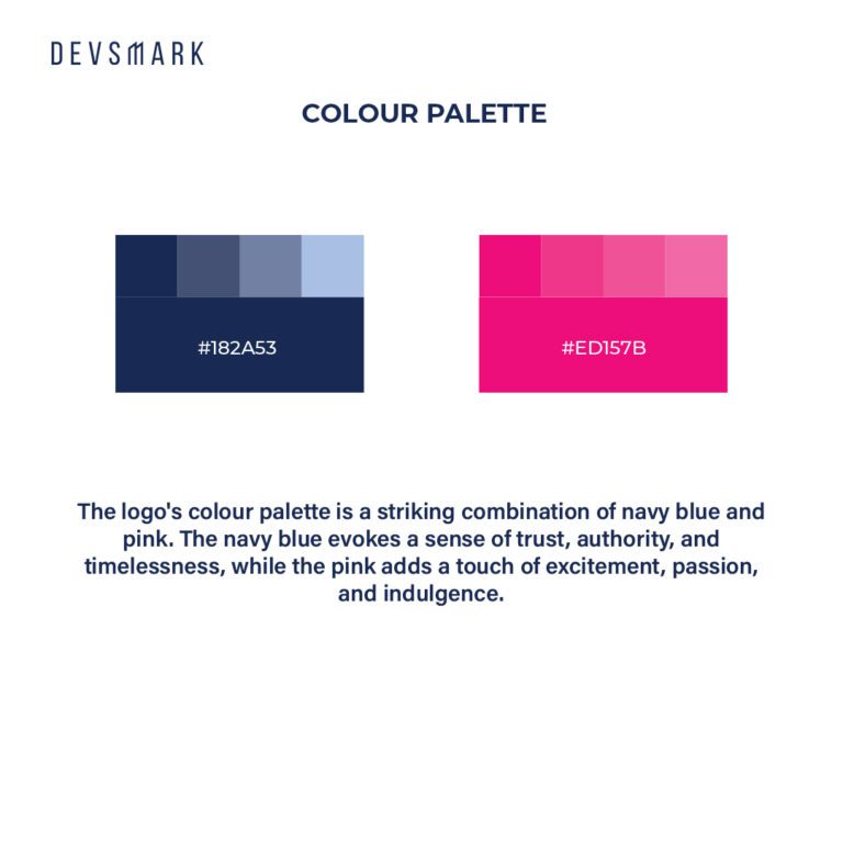
The logo’s colour palette is a striking combination of navy blue and pink. The navy blue evokes a sense of trust, authority, and timelessness, while the pink adds a touch of excitement, passion, and indulgence.
