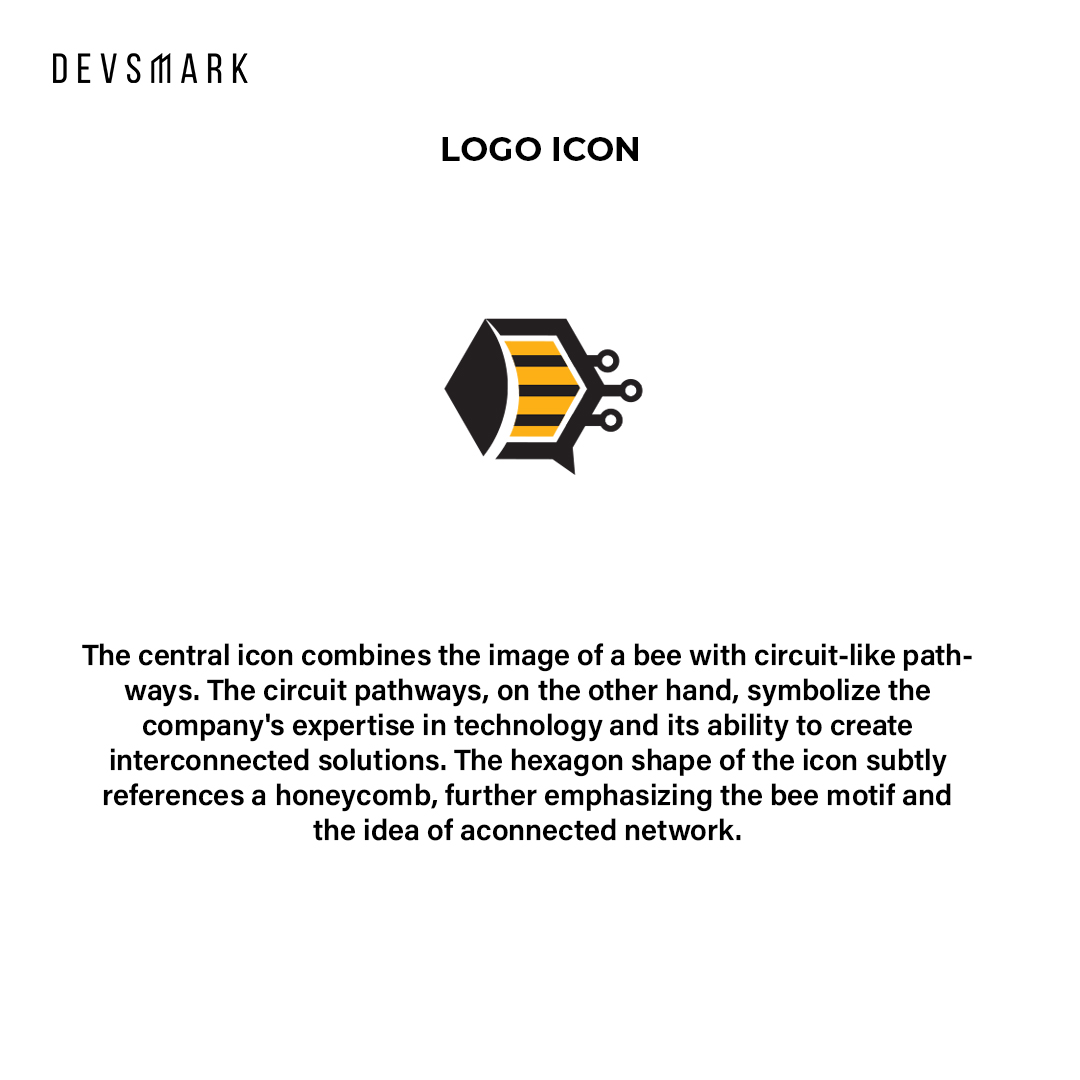
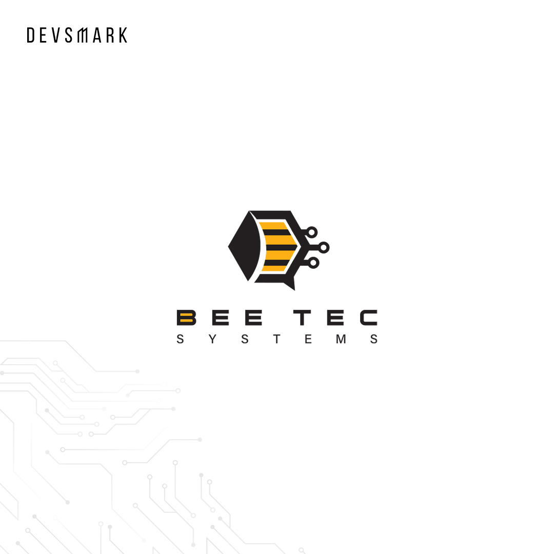
The central icon combines the image of a bee with circuit-like pathways. The circuit pathways, on the other hand, symbolize the company’s expertise in technology and its ability to create interconnected solutions. The hexagon shape of the icon subtly references a honeycomb, further emphasizing the bee motif and the idea of a connected network.
Typography
The central icon combines the image of a bee with circuit-like pathways. The circuit pathways, on the other hand, symbolize the company’s expertise in technology and its ability to create interconnected solutions. The hexagon shape of the icon subtly references a honeycomb, further emphasizing the bee motif and the idea of a connected network.
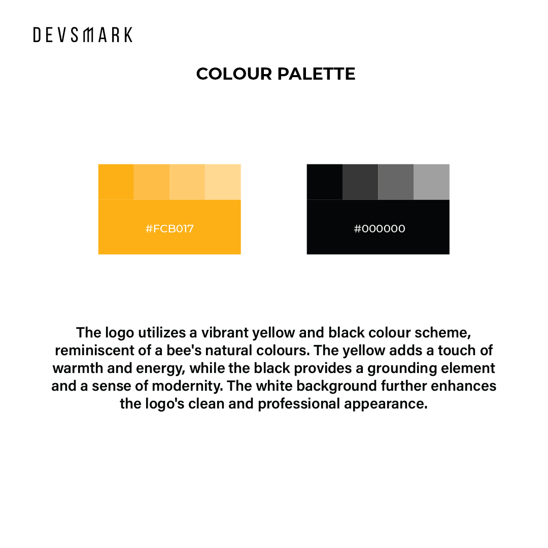
Colour palette
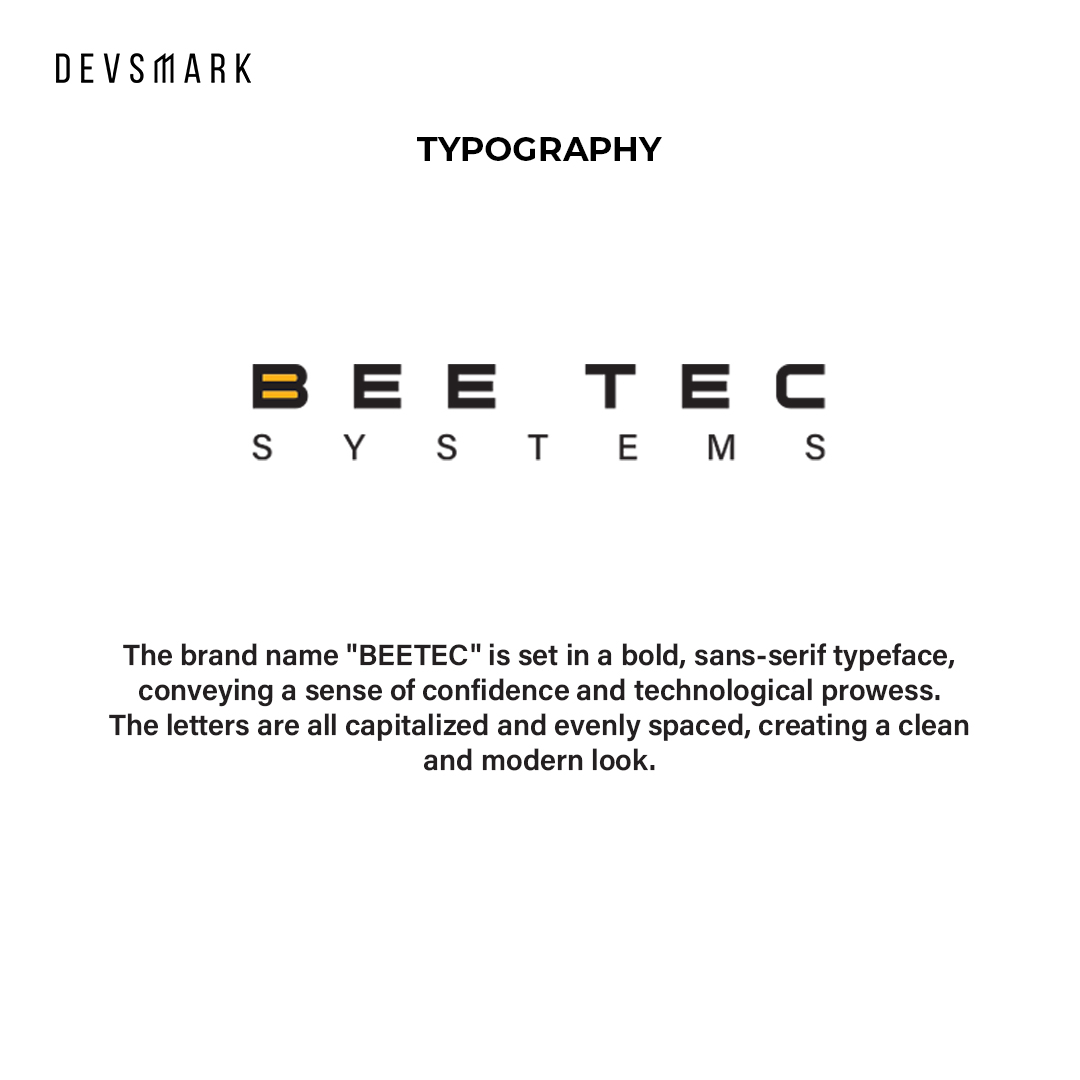
The brand name “BEETEC” is set in a bold, sans-serif typeface, conveying a sense of confidence and technological prowess. The letters are all capitalized and evenly spaced, creating a clean and modern look.