Ramon Gems Logo Design
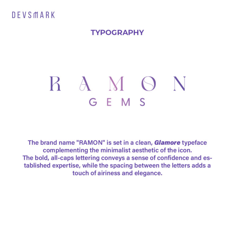
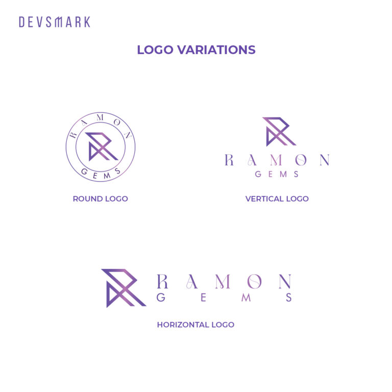
The brand name “RAMON” is set in a clean, Glamore typeface complementing the minimalist aesthetic of the icon.
The bold, all-caps lettering conveys a sense of confidence and established expertise, while the spacing between the letters adds a touch of airiness and elegance.
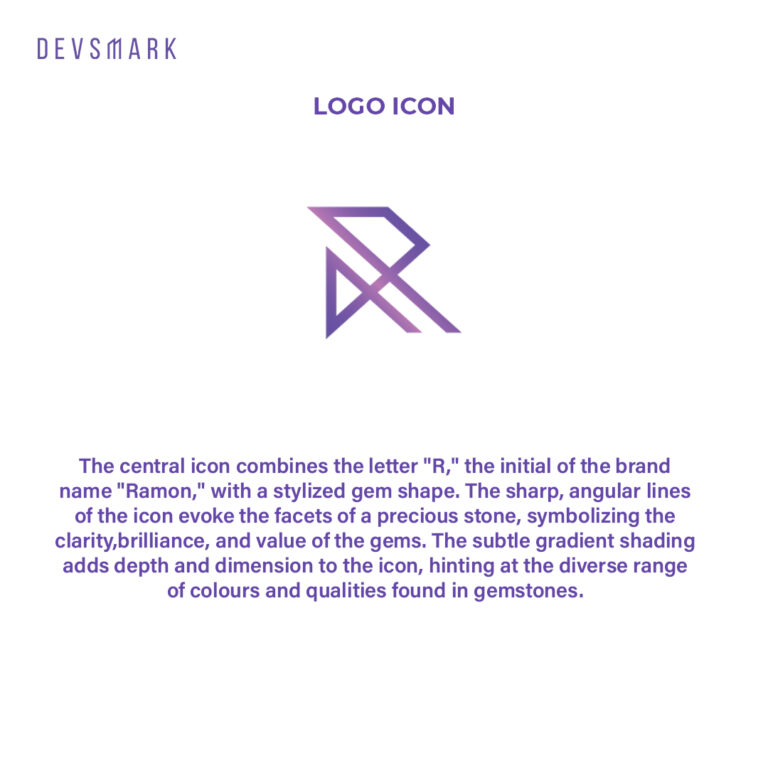
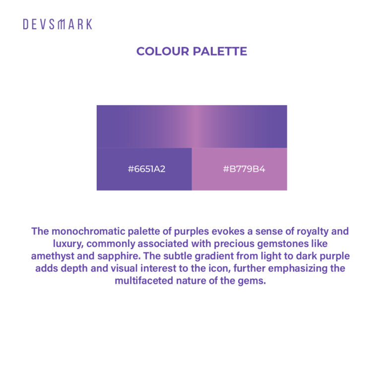
The central icon combines the letter “B,” the initial of the brand name “Ramon,” with a stylized gem shape. The sharp, angular lines of the icon evoke the facets of a precious stone, symbolizing the clarity,brilliance, and value of the gems. Thatsubtle gradient shading adds depth and dimension to the icon, hinting at the diverse range of colours and qualities found in gemstones.
