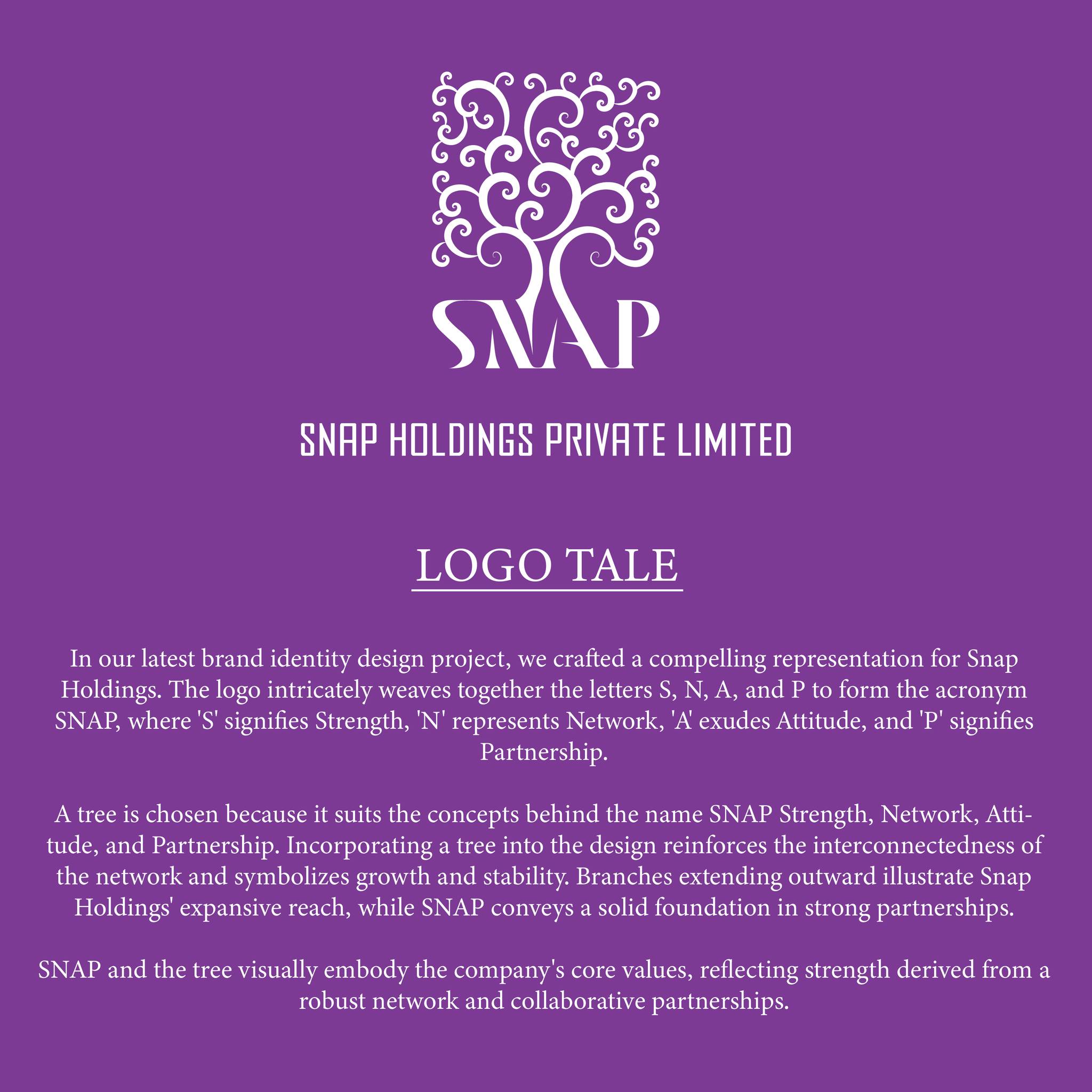
In our latest brand identity design project, we crafted a compelling representation for Snap Holdings. The logo intricately weaves together the letters S, N, A, and P to form the acronym SNAP, where ‘S’ signifies Strength, ‘N’ represents Network, ‘A’ exudes Attitude, and ‘P’ signifies Partnership.
A tree is chosen because it suits the concepts behind the name SNAP Strength, Network, Attitude, and Partnership. Incorporating a tree into the design reinforces the interconnectedness of the network and symbolizes growth and stability. Branches extending outward illustrate Snap Holdings’ expansive reach, while SNAP conveys a solid foundation in strong partnerships. SNAP and the tree visually embody the company’s core values, reflecting strength derived from a robust network and collaborative partnerships.